

Program officers are visiting your website right now. They’re evaluating your organization before they ever send that email or make that call. According to Root Cause, research shows that 72% of donors actively seek information about nonprofits online before giving. It’s just due diligence. And major funders do the same while reviewing your grant application. Your website is being audited, whether you realize it or not.
Free resource from CharityHowTo
195 Grant FAQs for Nonprofits: The Complete Grant FAQ — expert answers from Diane Leonard, GPC covering everything from grant writing to finding funders. Free and searchable.
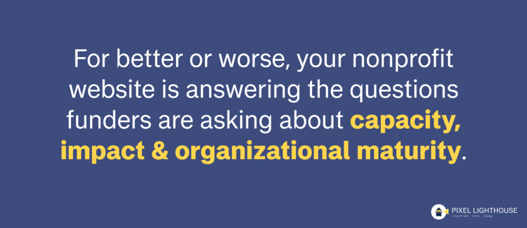
Here’s what most nonprofits miss: your website isn’t just a digital brochure. It’s evidence.
When a foundation is deciding between your organization and three others doing similar work, your website often becomes the deciding factor. Not because it’s prettier or has better photos, but because it answers the questions funders are actually asking about capacity, impact, and organizational maturity.
The good news? Making your website stronger in the eyes of funders doesn’t necessarily require a complete redesign.
With three strategic changes, you’ll address exactly what funders look for when evaluating whether your organization is the best fit for their investment. And most nonprofits can implement these fixes within just a few weeks.
Fix #1: Create an Evergreen Impact Page (With Real Data, Not Vague Claims)
Most nonprofit websites say “We’ve served thousands” or “Changing lives since 2010.” But funders want to see something more specific than that.
As they view your website, they’re trying to assess your organization’s scale, your measurement sophistication, and the tangible outcomes you’re creating.
They need to understand your methodology or how you actually measure success. And they want to see the logic behind your work, including how your activities connect to the change you’re creating in your community.
The bottom line: Funders want to see evidence of real impact, not just activity.
The Fix
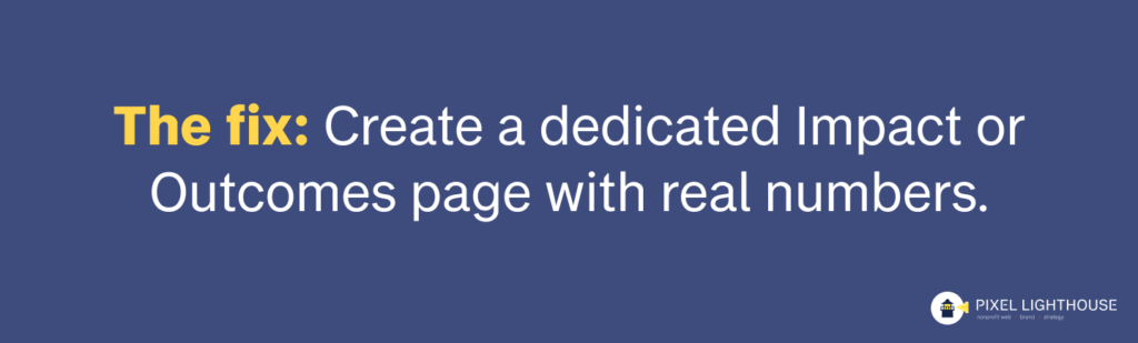
Create a dedicated Impact or Outcomes page on your website that serves as an evergreen resource. This doesn’t need to be updated every quarter; think of it instead as a comprehensive explanation of how you measure and achieve impact (one that remains relevant and compelling over time).
The key is to be specific about the change you’re creating, not just the activities you’re doing. Here are a few tips:
- Start with your logic model showing how your activities lead to outputs, which lead to outcomes.
- Include specific examples from recent years with real numbers. Something like: “In our most recent program year, we served 847 families. 68% achieved food security, tracked through our intake system.”
- Add a clear methodology statement explaining how you collect data, what you measure, and what counts as success in your framework.
- When possible, use simple charts or infographics to illustrate your impact rather than dense paragraphs full of numbers.
You don’t need to update this page constantly, as once or twice a year is plenty when it’s written in an evergreen way. Focus on creating a page that explains your impact framework clearly, includes compelling examples with real data, and demonstrates that you’re serious about measurement.
Free tools like Google Charts or Canva work well for creating basic visualizations without needing a designer. And always link to your annual reports for readers who want to see year-specific details.
Fix #2: Make Financial Information Ridiculously Easy to Find

Don’t make funders go digging for financial information.
Funders want to verify that you are a responsible steward of funds. When your 990s, annual reports, and audited financials are buried three clicks deep in some obscure corner of your site, or when they’re missing entirely, it creates immediate trust issues. The easier your financial information is to find, the more confident and transparent your organization appears.
It’s one of those indirect signals that communicates a major message. When financials are easy to find, you’re communicating confidence, transparency, and that you have nothing to hide. When they’re hard to find, you’re raising questions about potential problems, poor governance, or disorganized systems. When they’re not there at all, a foundation may even automatically disqualify you from consideration before they even reach out.
The Fix

Create a dedicated Financials page. On this page:
- Include your last three years of 990s as clearly labeled PDFs.
- Add your most recent annual report (and more, if you have them).
- If you have audited financial statements, include those too.
- If you don’t display them elsewhere, then list your board members to show who provides governance oversight.
- Include a simple pie chart or graphic showing your budget breakdown: what percentage goes to programs versus administrative costs versus fundraising.
- Consider adding a single sentence of context, something like: “We’re proud of our financial efficiency: 87% of funds go directly to programs.”
The location matters as much as the content itself. Put the Financial page directly in your main navigation as a dropdown, not buried under About > Board > Documents where someone has to hunt for it.
Another way to make life easier for funders searching for this information? Use clear, obvious file names: “IRS Form 990 (2023)” instead of something like “990_final_v2_updated.pdf” that only makes sense to your internal team.
If you only implement one fix from this entire article, make it this one as it doesn’t take long and many funders won’t even consider organizations that don’t meet this basic threshold of transparency. It’s table stakes for being taken seriously in the funding world.
Fix #3: Show Your Operational Systems (Yes, Really)

Make it clear that you have thoughtful well-organized systems in place.
Most nonprofits focus entirely on mission and impact in their website content, but they never demonstrate the infrastructure that makes service delivery actually possible. Here’s what funders are really evaluating when they look at your site:
- Can this organization actually execute on a grant?
- Do they have real systems and processes in place?
- Is there operational sophistication here beyond just passion for the cause?
- Can they scale if we give them more resources?
Your website reveals your operational maturity whether you intend it to or not. How your site functions and what it shows about your internal systems speaks volumes to people who know what to look for.
The Fix
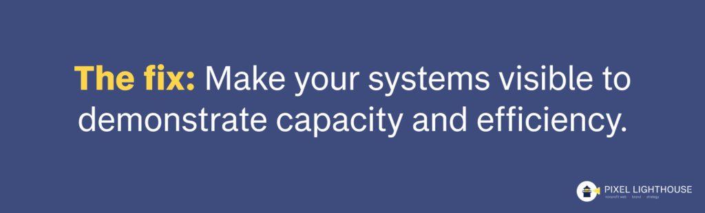
Make your systems visible instead of hiding them. Instead of saying “we have amazing volunteers,” show the systems you use to recruit and manage them. Display your volunteer application process with clear pathways. If relevant, include information about your training that demonstrates you have real onboarding systems. If you have a volunteer portal or scheduling system, mention it – that shows technical capacity. Share coordination details that reveal operational sophistication.
Here’s an example from a client who works with a 211 helpline. They created a “Get Involved” page that shows their online application with automated confirmation, their monthly virtual orientation schedule, clear role descriptions with expected time commitments, a volunteer dashboard for scheduling and tracking hours, and their recognition program for outstanding volunteers. What does this communicate to funders? That they can systematically onboard and manage people, which means they could likely handle significantly increased capacity if they received more funding.
Show your service delivery clarity too. Map out how people actually access your services, whether through phone, walk-in, or referral partners. Explain your intake process in enough detail that someone can understand you have a real system (and how it works). Describe your follow-up and support structures.
For example, you might structure it something like: “Step 1 – Initial Contact (phone, walk-in, referral), Step 2 – Needs Assessment (15-minute intake), Step 3 – Service Plan (customized based on assessment), Step 4 – Ongoing Support (case manager assigned), Step 5 – Progress Tracking (quarterly check-ins).” This demonstrates infrastructure and systematic thinking, not just good intentions and hoping for the best.
Another easy fix? Display your partnership network when relevant, which could include collaborative relationships with other organizations as well as referral systems that connect people to additional resources. The end goal is to show how you integrate with the broader ecosystem in your community. This demonstrates that you’re connected, collaborative, and creating multiplier effects rather than working in isolation.
The key is finding the balance between being transparent about your systems and overwhelming visitors with operational minutiae. Don’t write an operations manual. Instead, demonstrate competence and capacity through strategic details that matter to funders.
Bringing It All Together
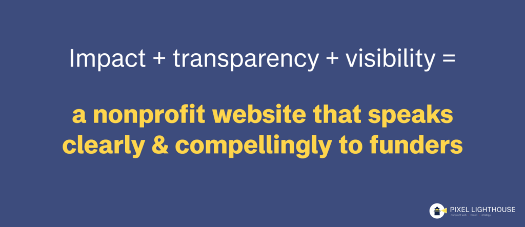
These three fixes work in combination with each other:
- Your impact page shows what you actually accomplish and how seriously you take measurement.
- Your financial transparency proves you’re trustworthy and well-governed.
- Your operational visibility demonstrates that you can scale effectively and execute on larger grants.
Together, they answer the core questions every funder is asking when they visit your site: Does this organization know what they’re doing? Can I trust them with funding? Do they have the capacity to actually deliver on what they promise?
If you’re wondering where to start, here’s how to prioritize implementation.
This week, focus on the easiest wins:
- Upload your 990s to your website in an obvious location.
- Add one data-driven outcome statement with your measurement methodology somewhere on your site.
- Then add a few operational details to one program page showing how people access your services or how you coordinate volunteers.
This month, work on the next tier:
- Create your dedicated Financials page with all the documentation funders expect.
- Build out your evergreen impact page with your logic model and measurement framework.
- And add systems visibility across your major program areas.
The real return on investment here goes beyond just winning grants. These fixes also make grant writing significantly easier across the board. Every single application asks for impact data, financial information, and evidence of organizational capacity.
When all of this exists on your website in an organized, accessible form, you’re no longer starting from scratch with every single proposal you write. Your website becomes the foundation that makes everything else more efficient.
Get Your Implementation Guide

You’ve just seen the fixes that separate websites funders trust from those they pass over. But knowing what to do and actually implementing it are two different things.
That’s why we created the Funder-Ready Website Toolkit. It includes a PDF quick guide with practical do’s and don’ts for a website that resonates with funders, a comprehensive checklist of what your site needs to have in place to be funder-ready, and a video walkthrough showing real examples of nonprofits getting it right.
Whether you’re applying for your first major grant or looking to attract larger funders, this toolkit helps you see your website through a funder’s eyes and prioritize the changes that will make the biggest difference.
About the Author:
Austin Hattox is Principal at Pixel Lighthouse, where he leads website design and branding projects for nonprofits nationwide. He began his career at Texas A&M University’s Natural Resources Institute building digital tools for conservation organizations before working with for-profit creative agencies. After a decade in the for-profit space, he shifted his focus to working exclusively with nonprofits that aligned with his values. Austin specializes in helping organizations translate their mission into digital experiences that attract funding and expand community reach.