
")
Your nonprofit website design is like the initial handshake for new supporters and revisitors!
So you want to make sure your site gives off an excellent impression, right?
But if you don’t yet have experience creating a website for nonprofit organizations, then you might not be totally sure how to give the first impression you’re looking for.
That’s okay!
Because we’ve rounded up the top 15 best practices for nonprofit website design!
And without further ado…
1. Choose the Best Nonprofit CMS for Your Organization
Before you choose your website design, your organization needs to start with the foundation.
Your nonprofit CMS, or content management system, is the platform that houses your website. Make sure it checks all the right boxes for what your organization needs!
How to Choose the Right CMS?
Choosing the right CMS for your nonprofit website will make all the difference in a design process that’s simple and one that’s overwhelming.
You’ll need to consider what your needs are for building a site. Do you have a nonprofit website development team? Do you have graphic designers on hand? If not, your needs may be different from a larger organization that does have those things.
The great news is that there’s a nonprofit CMS option for every organization, no matter what their needs are. From a platform that offers full flexibility and control like WordPress to one that gives more assistance like Squarespace, you’ll find one that suits your needs. Check out our guide on the top 3 platforms here!
2. Stay Consistent With Your Brand Identity
That includes your font, colors, and logos. Why is this important? Well, because your supporters want to know clearly who they’re looking at.
This is especially true with your nonprofit’s colors. According to Tailor Brands, color improves brand recognition by up to 80%! That means your supporters are 80% more likely to know your nonprofit based off of your brand colors alone.
This is important in your nonprofit website design because you don’t want to confuse anyone on where they are. You want to make it abundantly clear that they are supporting your cause!
That will also help when they go looking for you in the future to give again. If nothing else, they’ll remember your cause and your nonprofit brand identity.
How to Stay Consistent with Your Brand Identity in Your Website Design?
Stick with 2-3 colors that mesh well together for your website design. And use those consistently all throughout your site. For example, if your donate button has a light blue background, then make sure every single donate button throughout your site has the same light blue background.
To start with, choose only one font. That makes it super simple for you! And it keeps everything streamlined on your site.
Want to watch a free webinar on how to manage your brand using Canva? Check out our sister site, Charity How To!
Watch a FREE Webinar on How to Manage Your Brand Using Canva
at CharityHowTo!
3. Don’t Overcrowd Your Website’s Navigation
Your navigation is one of the most powerful features of your overall nonprofit web design. It tells readers where to go. It tells them what’s important to view on your site.
A navigation bar that is too crowded is usually a one-way ticket for readers to go back to where they came from! That’s because there’s too much content on the internet to bother with something that takes too much time and energy for them to understand.
So making sure you don’t bombard readers with too many links to different pages is key! Your navigation should be intuitive and easy-to-use. And it should be easily accessible no matter what page your reader is on.
How to Keep Your Nonprofit Website’s Navigation Intuitive:
You may want to have two different navigation bars on your site.
One is your main navigation. This goes at the top of your web design on every page. Your main navigation can house your most important information for readers:
- Home
- Our Story / About Us
- Donate
- Get Involved
Underneath each of those pages, you might include a few additional pages that fall under that category. For example, under a “Get Involved” tab, you may have drop down menu that includes pages like:
- Ways to Give
- Create Your Own Fundraiser
- Monthly Giving Program
- Marketplace
The second navigation is your secondary. It typically goes at the bottom of each page! This may have more nuanced information that still may be relevant to readers. For example, your secondary web design navigation might include:
- Contact Us
- Careers
- FAQs
- Privacy Policy and Terms of Service
Just remember, the secondary navigation has important information. But it’s not as important as the main navigation!
4. Keep the Design Simple
With the amazing designers that are out there now, it’s easy to get your hands on a nonprofit website design that looks incredible.
But too often, we get carried away with the excitement of website design. And we want to have a bunch of stuff right on the first page.
In the long run, and for your supporters, that leaves them feeling overwhelmed. And the design might interfere with them engaging with your cause!
Keep the design simple and minimal.
How Do You Keep Your Website Design Minimal?
Make sure you have plenty of “negative” space or white space around your copy. Don’t clutter your website with huge chunks of text. That instantly keeps your supporters from reading it because they’ll be intimidated by everything they have to read!
Only use videos and photos where they’re strategically necessary. Don’t bog down your website with too many photos or videos that just keep your supporters scrolling endlessly.
Have a nonprofit website design that’s simple and minimalistic. Avoid ones that are too busy feeling and don’t clearly point your supporter on where they should click next. That’s a great way to have them click the back button instead!
5. Tell Your Story
Your supporters want to know more about who you are as an organization, and how you got started.
Your story is the whole reason behind your nonprofit organization! It’s the sole purpose. So be sure to share it!
How to Tell Your Story on Your Website?
Use your about page to take your supporters back to the very beginning. And be sure to actually tell it as a story! That way you engage with your supporters from the start.
Your readers also want to know what you’ve accomplished since starting. So add in some statistics! How much have you raised over the years? What are the major milestones you’ve met in your nonprofit efforts?
This is also a great time to highlight some of the incredible volunteers and team members you have!
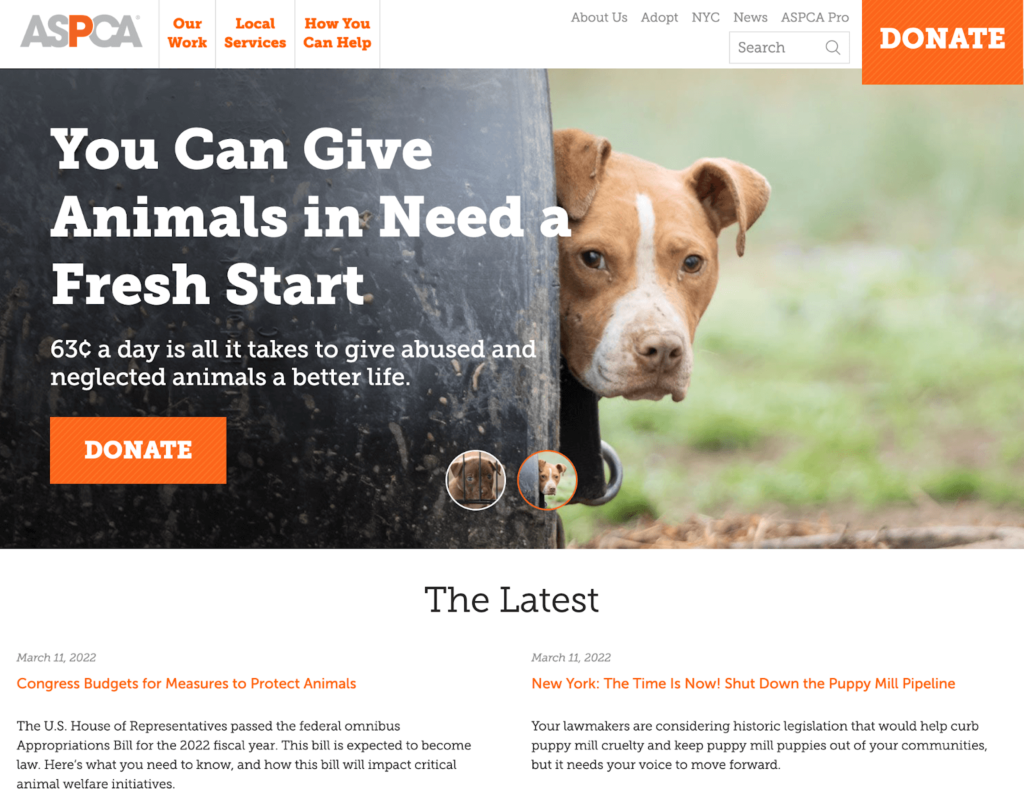
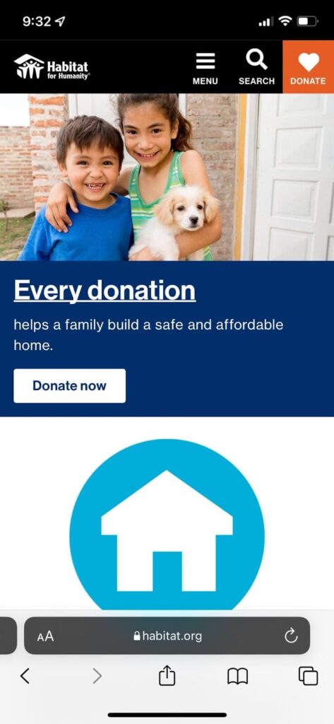
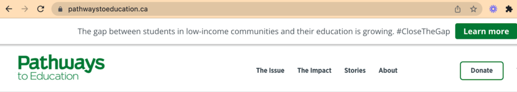
6. Have Your Donate Buttons Clearly Marked
Believe it or not. If you don’t have a “donate” button clearly marked in your nonprofit website design, you’ll see a drastic decrease in your contributions!
That’s because your supporter wants to be told what to do next and where to go. If it’s too confusing for them, or if it’s not clearly marked, they’ll end up hitting the back button.
How to Clearly Mark Your Donate Buttons on Your Site?
Use a different color background for your button than you use for the rest of your website design. That will easily set it apart!
You also want to make sure the text in the button is nice, bold, and crisp. Make it stand out from your website design. Kind of like the sign holders outside of the tax stores. They’re making a show of it, saying “we’re right here!”
You’ll probably want to include it throughout your website design instead of in just one spot. For example, have a clearly marked “donate” button at the top corner of your website navigation bar. Put it in the footer of your website pages. And have it throughout your website copy (where it makes sense!). Use your online donation platform to do this!
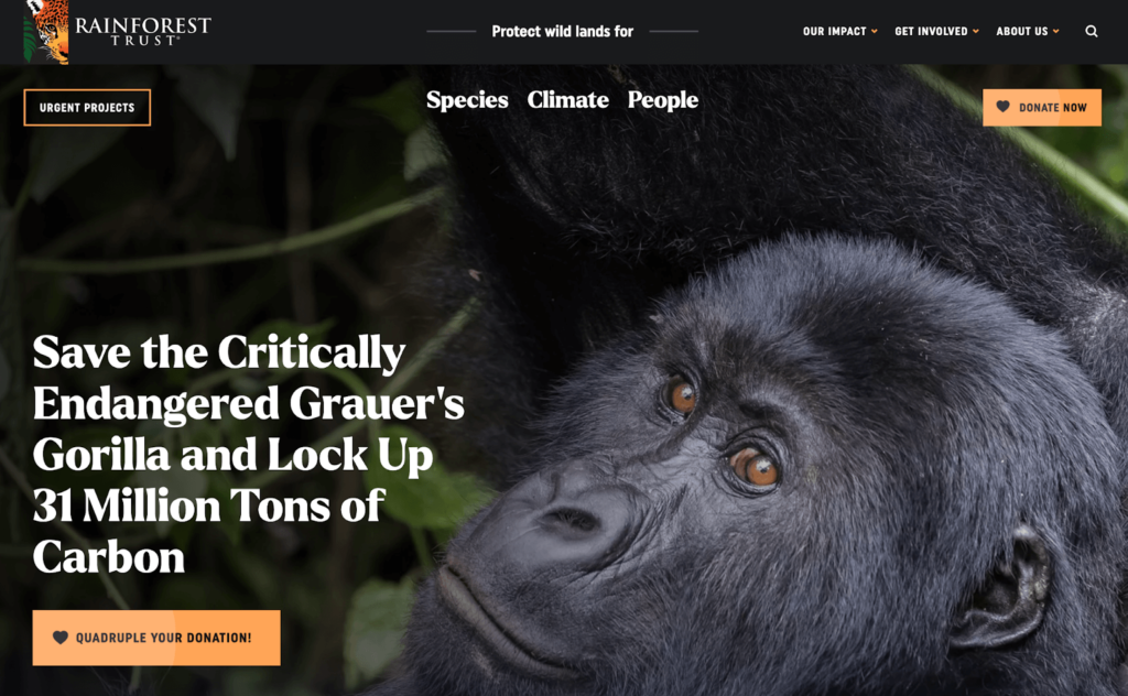
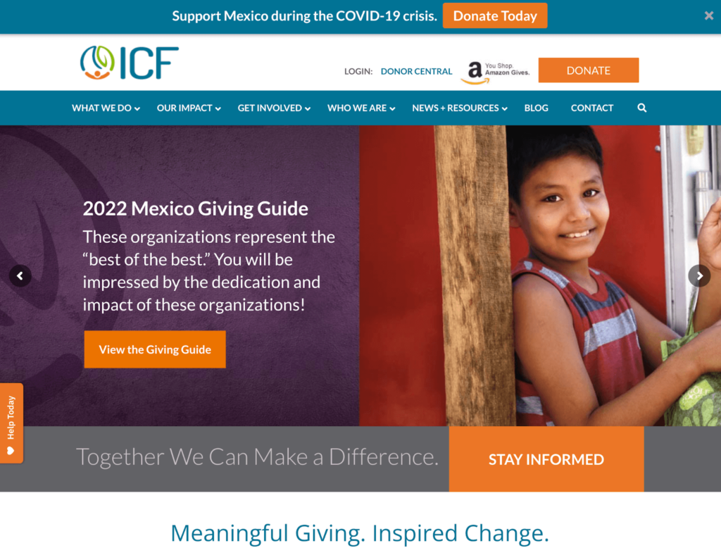
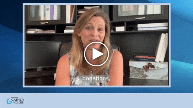
7. Use Photos and Videos Strategically
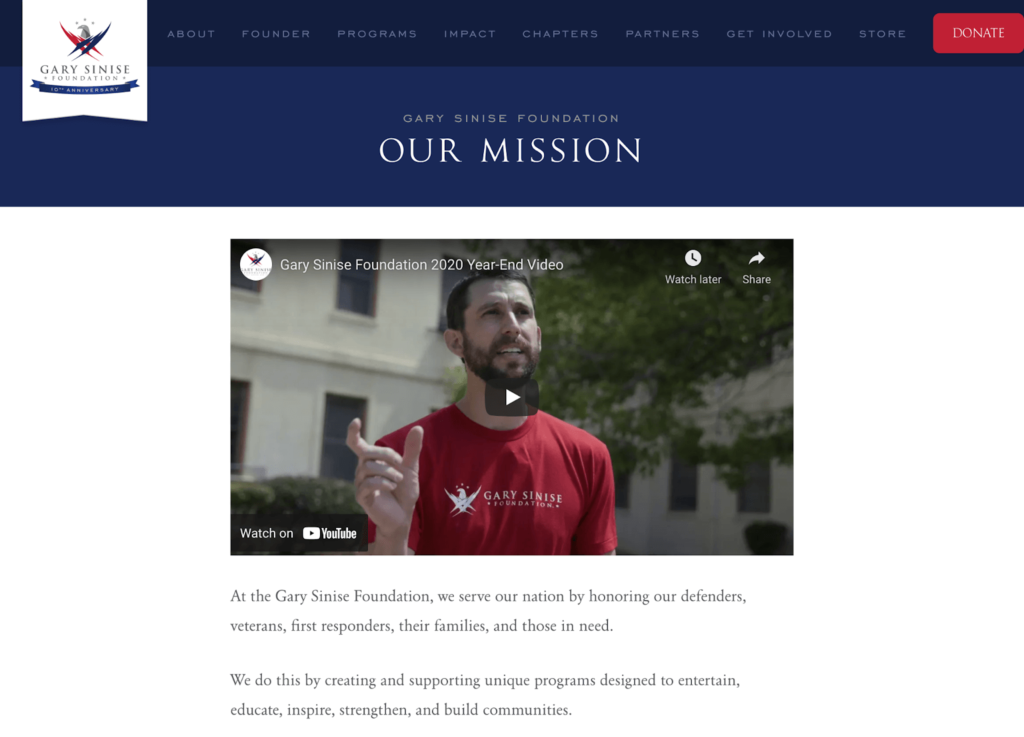
Visual content goes a long way when it comes to nonprofit website design! It allows readers and supporters to better connect and engage with your cause.
By using photos and videos throughout your website (strategically, might we add!), you’re letting your readers “put a face to a name,” so to speak.
How to Have Compelling Photos and Videos for Your Nonprofit Website Design?
The best way to do this is to have photos and videos of your own nonprofit. While stock images are easy to grab if you have no other option at the moment, they don’t create the same effect as your own photos do.
Take photos of events, of your volunteers, of your team members working. And incorporate those into your nonprofit website!
The best places to put your images so they’re strategic? Have one in the “hero” section of your website. That’s on your home page when someone first lands on your website. They should be greeted with a beautiful photo before they even have to scroll!
And have video content on your story page so your readers can see the actual happenings of your organization.
8. Create an SEO-Friendly Website!
SEO is going to help make sure your nonprofit organization is found whenever someone searches for target keywords about your mission.
And this is a huge part of your marketing strategy for your nonprofit. But it starts with your website design! So whether you learn to do it yourself, or you hire someone who can assist you with making sure your site is SEO-friendly, make sure you do this.
How to Make Sure You Have an SEO-friendly Website?
Google prioritizes quality, valuable content first. So make sure all of the website copy is written with that top of mind.
Keep your website design and your content up to date. It’s a great idea to have a blog for your website because that will also notify Google that your website is constantly updated. As long as you’re creating fresh content, that is!
Find out what your supporters are searching for by doing some keyword research. Then sprinkle those keywords throughout your website design so Google understands that’s what your site is about.
9. Keep Your Nonprofit Website’s Site Speed Ultra Fast
A major part of SEO for nonprofits is making sure your web design isn’t too slow. If you do happen to have a site that takes too long to load, your readers will be more likely to bounce right off.
They’ll miss out on the incredible work you’re doing because they don’t want to wait for it to appear on their screen! That’s just the nature of an online presence in the 21st century.
How to Make Sure Your Site Speed is Wicked Fast?
The first thing you need to do is test your site speed. You can do that with this site speed test tool! Ideally, you want your nonprofit web design to load within 3 seconds.
If the site loads slowly (3 seconds or greater), there are a few things you can do. First and foremost is go through all of your images and videos and make sure they’re compressed. Decreasing the file size makes site designs easier to load.
And if you’re using a nonprofit CMS like WordPress, then go through and remove any unnecessary plugins. Those are actually boosting the site speed!
If those two tips still don’t make a difference (or at least not enough of a difference), then check out this HubSpot guide to improving site speed.
10. Include an Email Opt-In
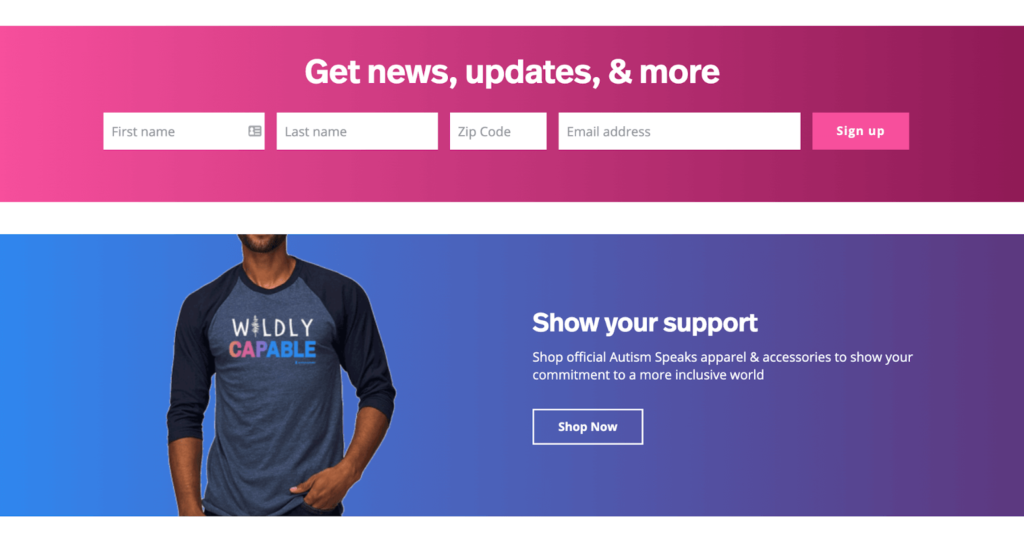
Whether it’s a form at the bottom of the screen or it’s a pop-up that encourages supporters to sign up, include an email opt-in.
This will help you grow your email list of people who support your cause. And thanks to these statistics about online fundraising for nonprofits, email marketing has one of the biggest ROIs for nonprofits!
How to Include an Email Opt-In in Your Nonprofit Website Design?
First things first, you want to entice your supporters to sign up for your email newsletters. So make sure the copywriting around your email opt-in is engaging enough that they want to put their information in the boxes.
You also want to make sure you’re totally clear on what your supporters are getting when they do give you their information. Are they getting weekly newsletters? Monthly newsletters? No matter what it is, let them know. And then stick with that! They’ll know they can trust your word when you do so.
Then, your email marketing platform should generate a code that you can plug straight into your website design (or have your website designer do it for you). One of our favorite ones, that’s low-cost for nonprofits, does exactly this!
Voila! An email opt-in for your nonprofit website.
11. Make Sure Your Site is Mobile Friendly
Google has already come out saying that it’s prioritizing mobile-friendly websites when it comes to SEO. And that’s because more and more people are using their phones to browse the internet!
And let’s put it this way. Over 25% of donors give a contribution with their mobile devices (Nonprofit Source).
How to Make Sure Your Nonprofit Website Design is Mobile-Friendly?
If you’re using a platform that allows themes, like WordPress, opt for a mobile-responsive theme or template. That means when someone uses their phone to go to your site, the theme automatically reconfigures to match the screen size! That’s the easiest way to make sure your nonprofit site is mobile-friendly.
You’ll also want to use a large and readable font so people using smaller screens can still read your content. And definitely avoid scrunching content, images, and videos together! Remember to use the white space so supporters aren’t overwhelmed and click the back button instead.
12. Focus on Copywriting
Would you believe us if we said that the majority of your nonprofit revenue comes from being able to communicate your nonprofit’s mission effectively?
That’s the power of copywriting for nonprofits! Making copywriting and storytelling a priority on your site is crucial to nonprofit website best practices.
How to Write Better Copy for Your Nonprofit Website Design?
One of the biggest keys for writing better copy is making sure that your donor comes first. Many nonprofit organizations fall under the spell that they are the “hero” in the journey.
But in reality, the donor is the hero. They’re the ones making the contribution to help your mission!
Treating them as such by tailoring your nonprofit copywriting around them (instead of only around your nonprofit), is one of the best ways to ensure conversion.
Try doing that first! Then, take your copywriting skills to the next step with this training at CharityHowTo.
Learn More About Nonprofit Copywriting for Online Fundraising at CharityHowTo!
13. Secure Your Website From the Get-Go
It’s wonderful to have a beautiful nonprofit website design! But if it’s not secure, then it might all be in jeopardy.
A site that’s not properly secured is at risk for hackers and other cyberattacks. And that’s the last thing your nonprofit website needs to deal with, much less the supporters who are trying to help your cause!
How to Secure Your Nonprofit Website?
Use the right cybersecurity for nonprofits technology to make sure your site is secure!
We have an entire guide on cybersecurity for nonprofits. And we have another article about the top cybersecurity technology for nonprofits on the market right now!
14. Remind Them Where Else You Can Connect
Some readers won’t be ready to donate right away. And that’s okay! They just need a stronger relationship with your organization.
So, the best thing you can do is tell them where else they can connect and interact with your nonprofit.
How to Show Them Where You Can Connect?
In the secondary navigation and sometimes in the main navigation (depending on how busy it is), you can put linked icons for your social media channels.
15. Keep Your Website Accessible for All Readers
Not every person has the same abilities to navigate a website. So making sure your site is accessible to all readers means you can reach a wider audience!
How to Make Your Website Accessible for All Readers?
Accessible nonprofit website design best practices take into consideration readers with visual, physical, or audio impairments.
It’s a great idea to make sure that all images and videos have alt text, which simply describes what’s happening in an image.
If you have any nonprofit videos on your site, make sure captions are automatically turned on.
You can also use nonprofit tech tools, like Accessibe, to make sure your site is accessible for all readers!
And there you have it! The top 15 best practices for nonprofit website design so you make an amazing first impression on your supporters.
Want More Related to Nonprofit Website Design? Check Out These Posts!
The 7 Best Low-Cost and Free Tools for Nonprofits to Boost Your Cause
The Top 6 Nonprofit Cybersecurity Software to Protect Your Mission
The Top 30 Statistics You Need to Know About Digital and Online Fundraising for Nonprofits